
Well, in this article there is a picture that shows "Gallery Furniture" across their chest:
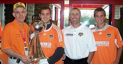
I think the original jersey looks better; but the logo is subtle enough and it hopefully makes the club a bit more profitable (and, thus, stable). I think the La-Z-Boy logo would bring more irony. The Orange Crush logo would be more approriate. This Gallery Furniture one is less of a surprise.